Wingsoft Website Case Study
A well-designed website is crucial for conveying professionalism, clarity, and trust—especially in the enterprise software industry. WingSoft, a company offering technological solutions, has a functional website but with significant room for improvement. In this analysis, we’ll break down the strengths and weaknesses in terms of user experience (UX), interface (UI), navigation, content, and performance to identify opportunities for optimization and higher conversion rates.

01
First Impression and Visual Hierarchy
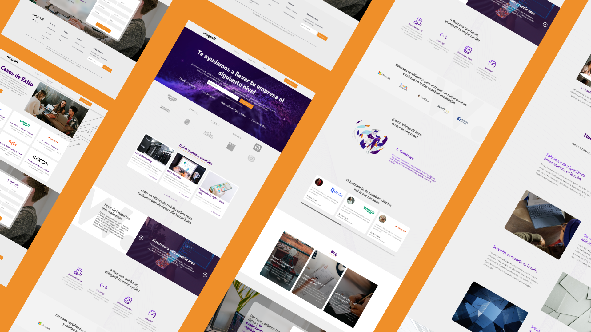
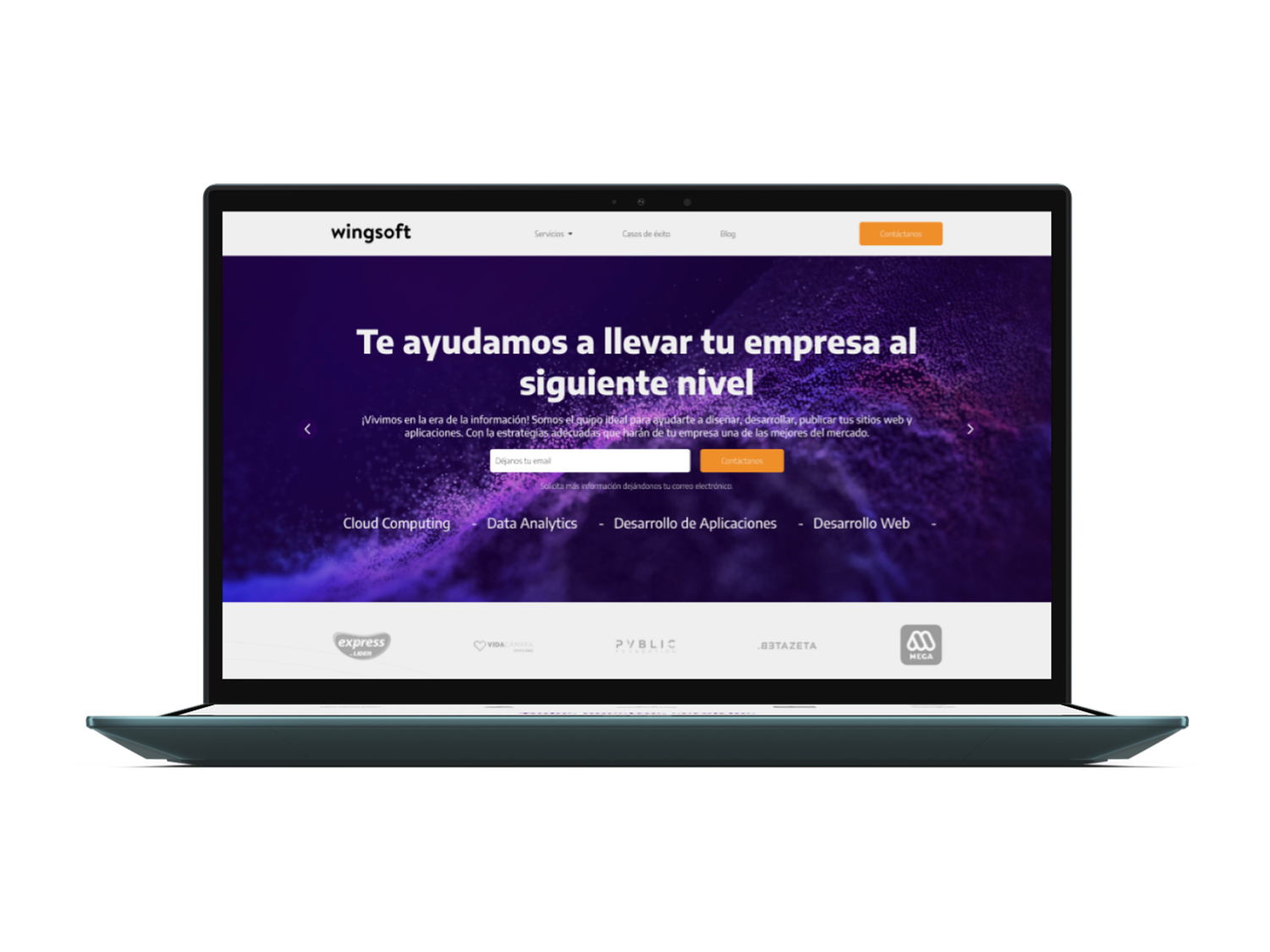
Upon entering WingSoft.com, the first impression is a minimalist design with a corporate color scheme (blue and white), which conveys seriousness and reliability—key traits in the enterprise software sector. However, the hero section (the top of the page) fails to clearly communicate what the company does. The main headline only says «WingSoft» without a subheading or tagline explaining its value proposition.
Compared to competitors in the same industry, successful websites often include a concise subheading below the logo, such as:
«Custom ERP Solutions to Optimize Your Business.»
This small change would drastically improve immediate comprehension of their services.
Additionally, while white space is well-utilized, the background image (generic programming code) doesn’t add much value. A better alternative would be an illustration of a software dashboard or a team working with the platform, creating stronger engagement with the target audience.
Navigation and Usability
The menu structure is simple and straightforward, with clear sections like «Home», «Products», «Services», and «Contact.» This is a positive aspect, as it avoids overwhelming users with too many options.
However, two critical issues stand out:
No sticky navigation: When scrolling, the menu disappears, forcing users to scroll back up to switch sections. This harms usability, especially on long pages.
Missing search functionality: For a site offering multiple technical solutions, a search bar would help users who already know what they need (e.g., «invoice module»).
Another detail is that call-to-action (CTA) buttons could be more prominent. Currently, the light blue color of the «Contact» button lacks sufficient contrast with the background. A more vibrant shade (like electric blue or even a corporate orange) would boost conversions.
02
03
Content and Messaging
The content is technically accurate but too generic. Phrases like «We offer tailored solutions» don’t differentiate WingSoft from competitors.
How to Improve?
Add case studies: Brief client testimonials or industry-specific examples (e.g., «How we helped a retail chain cut costs with our ERP»).
Less text, more visuals: Long descriptive sections could be replaced with infographics, explainer videos, or interactive software screenshots.
Benefit-driven language: Instead of saying «Our system is modular,» try «Customize the software to your needs without paying for unnecessary features.»
Performance and Mobile-First Design
The site appears to be built on stable technology, but there are responsive design issues:
On mobile, some elements (like the footer) don’t adapt properly, causing unwanted horizontal scrolling.
Buttons are too small for touchscreens, making navigation difficult.
Load time is decent but could improve with image optimization and lazy loading.
Tools like Google PageSpeed Insights or GTmetrix could help identify technical bottlenecks.
04
05
Trust and Authority
A common issue in B2B websites is the lack of social proof. WingSoft doesn’t showcase:
Logos of recognized clients.
Security certifications (ISO, SOC2, etc.).
Customer reviews or satisfaction ratings.
Adding these elements to the homepage would boost credibility, especially for first-time visitors.


