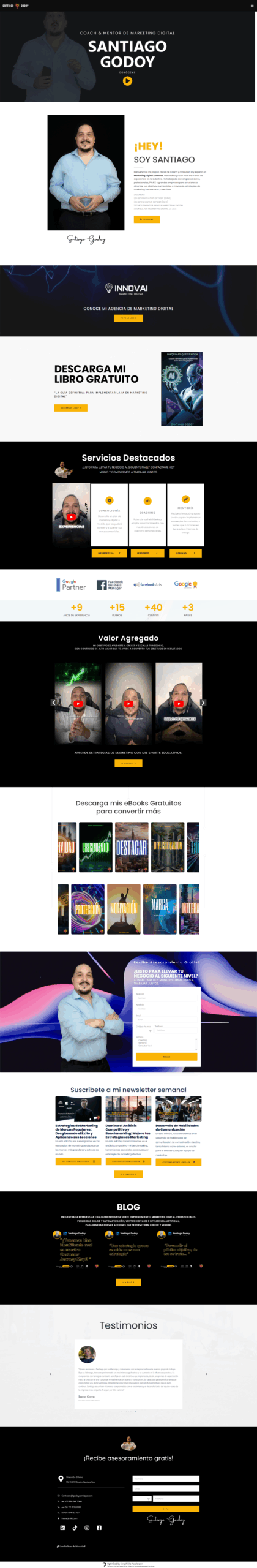
Digital portfolios are the main showcase for designers and developers. The website godoysantiago.com shows a minimalist approach but needs key optimizations to improve its professional impact. This analysis evaluates structure, content, usability, and effectiveness in project presentation.
The main objective of the website redesign was to modernize its online presence, aligning the design with the company’s values and mission. Additionally, the goal was to improve navigation and accessibility, so users could quickly find relevant information about the services offered.
Specific objectives:
Redesign the interface for a more intuitive user experience.
Enhance the visual aesthetics and consistency with the brand identity.
Optimize the site for smoother, mobile-responsive navigation.
Present relevant content clearly and accessibly.
Increase conversion rates through contact forms and calls-to-action (CTAs).
Research and Analysis
Before diving into the design, thorough research was conducted on the brand, its target audience, and its competitors. The following key user characteristics were identified:
Professionals from companies in specific industries.
Potential clients looking for personalized solutions and efficient strategies.
The previous website was analyzed to understand its weaknesses, such as confusing navigation, lack of modern visual elements, and poor mobile interactivity.
02
03
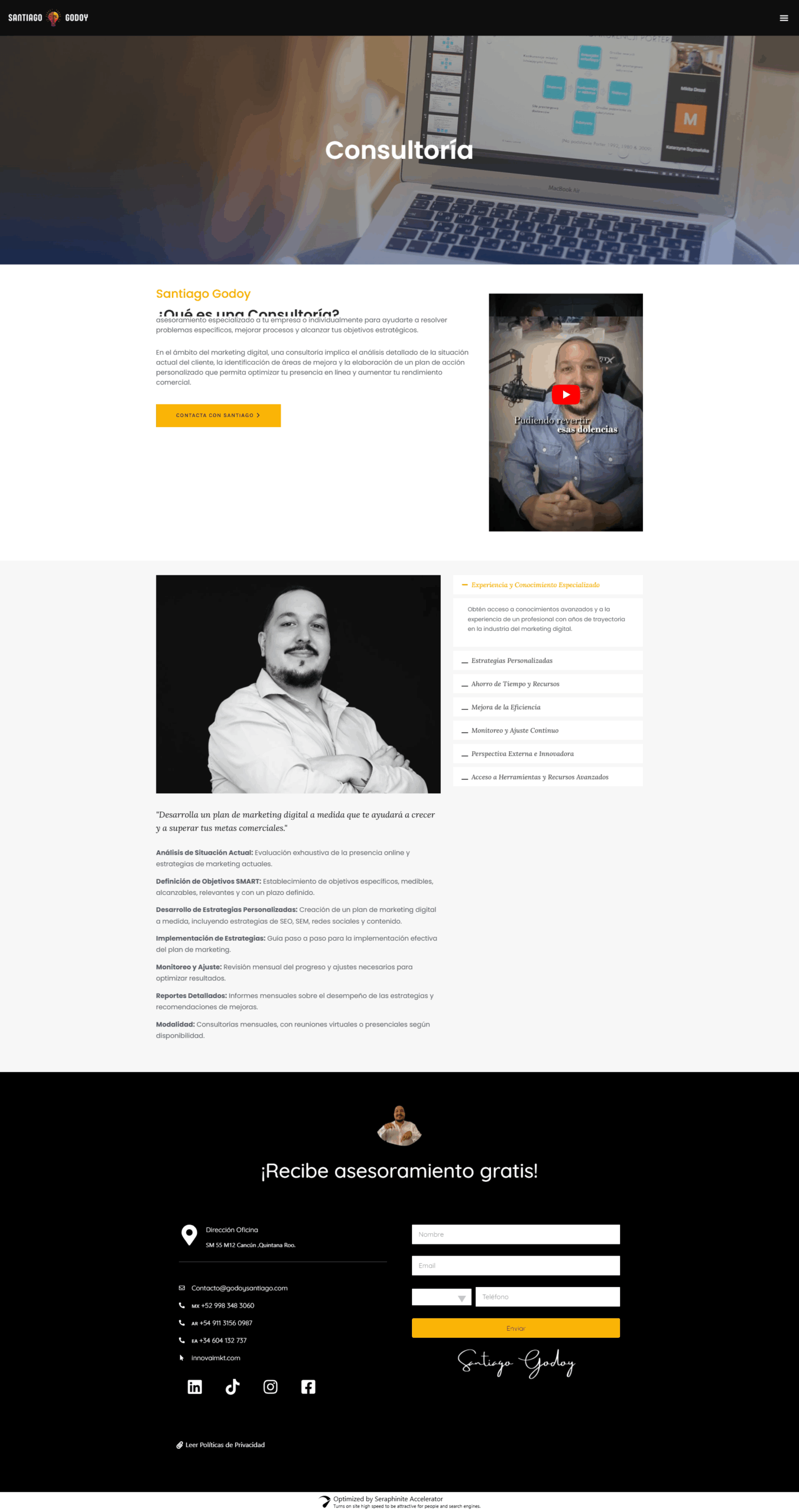
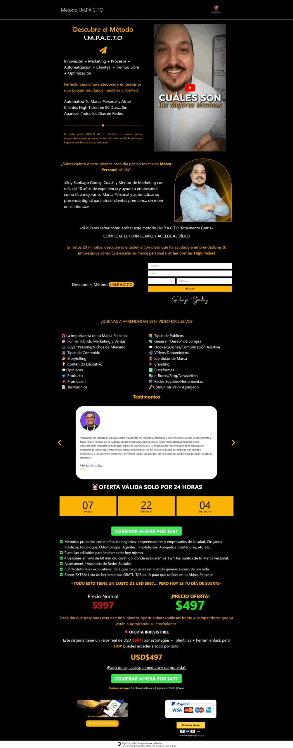
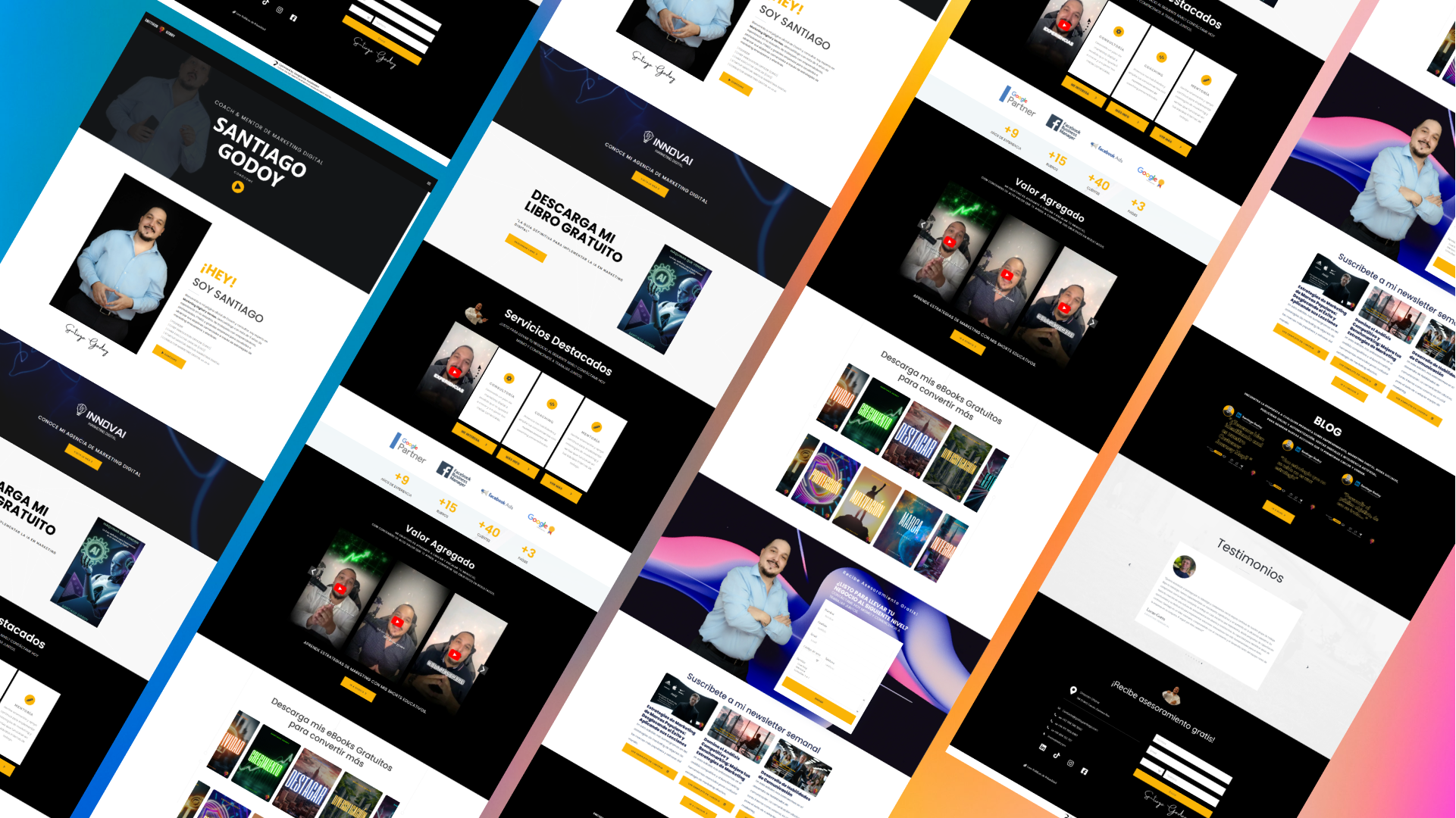
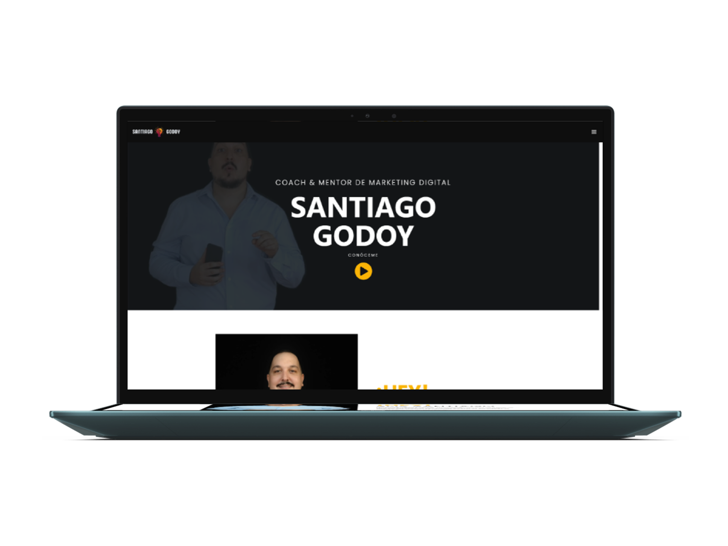
Design Solutions
Visual Redesign:
The redesign focused on a minimalist approach, using a sober and professional color palette that evokes trust. Visual elements like iconography and typography were chosen to complement the brand’s identity.
Typography: A modern, legible typeface was selected to enhance readability and align with the client’s visual identity.
Structure and Navigation:
The navigation menu was simplified so users could quickly find the information they were looking for without unnecessary clicks.
A clear content structure was created, ensuring that each service was prominently displayed, making it easier for users to find relevant information.
Mobile Optimization:
The site was fully optimized for mobile devices, ensuring users could access all content seamlessly on any device.
Calls-to-Action (CTAs):
Visible, easy-to-access CTA buttons were added, such as “Request a consultation,” to increase conversions from visitors to potential clients.
Development Process
A combination of HTML5, CSS3, and JavaScript was used to develop the site, ensuring it was responsive and easy to maintain. WordPress was chosen as the CMS platform, allowing the client to update the content independently, without relying on an external developer.
04
05
Results
The website redesign significantly improved the user experience and made navigation easier. Users can now find what they are looking for more quickly, leading to a reduction in bounce rates and an increase in interactions with the contact form.
Key Metrics:
Increase in conversion rates: Interactions with the contact forms grew by 30% in the first three months.
Improvement in time spent on the site: Users now spend 20% more time exploring the content.
Mobile optimization: Mobile traffic increased by 40%, due to the improved mobile experience.